


You can elevate your web design by incorporating patterns and textures that create a rich, immersive experience, drawing users in and guiding their attention through a visually stunning hierarchy of elements. By balancing size, color, and placement of elements, you can create a clear visual hierarchy that guides the user's eye. Adding textures that evoke emotions and combining patterns can add depth and visual interest. Experimenting with contrast techniques and balancing visual interest elements can also enhance the user experience. As you explore these techniques, you'll discover how to craft a design that's both aesthetically pleasing and functional, and uncover more secrets to creating a truly immersive experience.
 Establishing a clear visual hierarchy is crucial, as it guides the viewer's attention through your website, creating a seamless user experience. You want to direct your users' eyes to the most important elements, and a well-structured visual hierarchy helps you do just that. It's like creating a roadmap for your users' attention, ensuring they focus on what matters most.
To achieve this, you'll need to balance size, color, and placement of elements. Use headings, subheadings, and paragraphs to create a clear structure. Make sure your typography is consistent, with clear differences between headings and body text. You can also use color to draw attention to specific areas or to create contrast. Don't forget about whitespace – it's essential for creating a clean and uncluttered design that guides the user's eye.
Establishing a clear visual hierarchy is crucial, as it guides the viewer's attention through your website, creating a seamless user experience. You want to direct your users' eyes to the most important elements, and a well-structured visual hierarchy helps you do just that. It's like creating a roadmap for your users' attention, ensuring they focus on what matters most.
To achieve this, you'll need to balance size, color, and placement of elements. Use headings, subheadings, and paragraphs to create a clear structure. Make sure your typography is consistent, with clear differences between headings and body text. You can also use color to draw attention to specific areas or to create contrast. Don't forget about whitespace – it's essential for creating a clean and uncluttered design that guides the user's eye.
 As you explore the world of textures in web design, you'll discover that certain tactile sensations can evoke strong emotional responses. You might find that a rough, stone-like texture reminds you of a childhood hike, while a smooth, glass-like texture conjures up feelings of luxury.
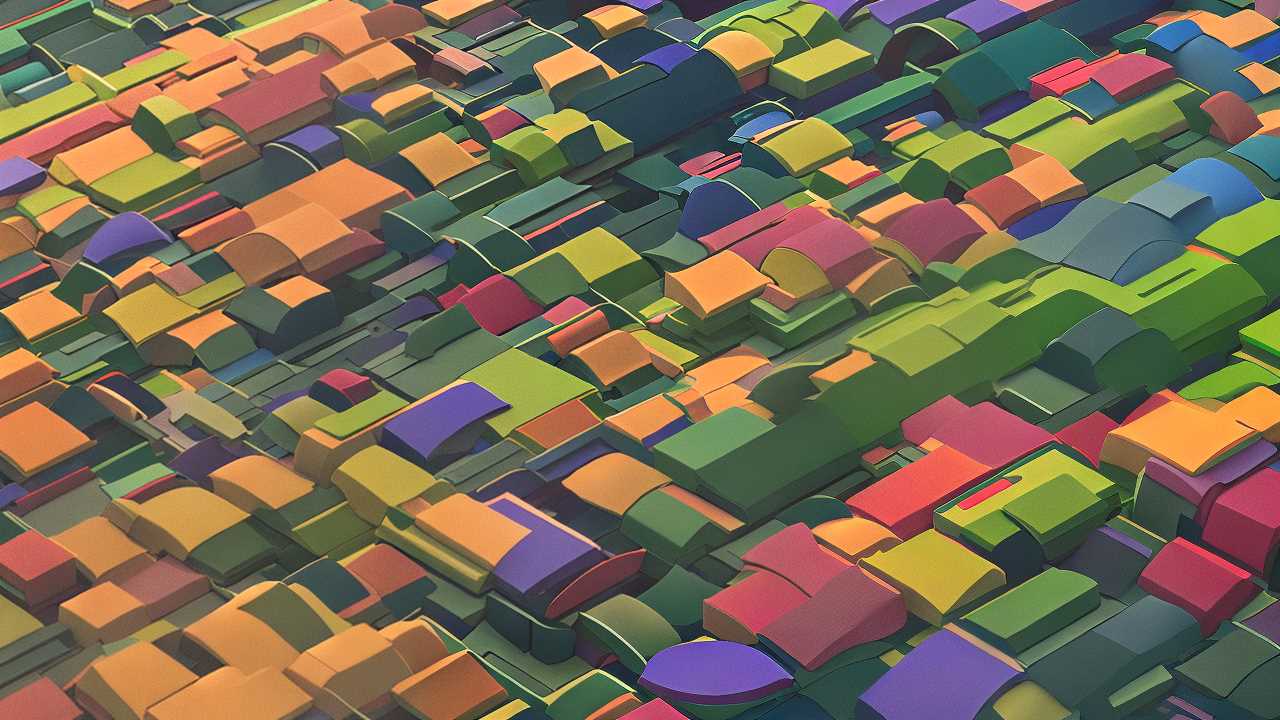
 You'll often find that incorporating pattern play in web design can elevate your website's visual appeal, creating a more engaging user experience. By combining different patterns, you can add depth, texture, and visual interest to your design. To get started, try pairing bold geometric patterns with subtle textures to create a sense of balance. You can also experiment with contrasting scales, orientations, and colors to add visual tension.
Don't be afraid to mix and match different patterns to create a unique look that reflects your brand's personality. When using pattern play, it's essential to consider the overall aesthetic you want to achieve.
For instance, if you're designing a website for a children's brand, you might opt for playful, whimsical patterns like polka dots or stripes. On the other hand, if you're designing a website for a luxury brand, you might choose more sophisticated patterns like herringbone or chevron.
You'll often find that incorporating pattern play in web design can elevate your website's visual appeal, creating a more engaging user experience. By combining different patterns, you can add depth, texture, and visual interest to your design. To get started, try pairing bold geometric patterns with subtle textures to create a sense of balance. You can also experiment with contrasting scales, orientations, and colors to add visual tension.
Don't be afraid to mix and match different patterns to create a unique look that reflects your brand's personality. When using pattern play, it's essential to consider the overall aesthetic you want to achieve.
For instance, if you're designing a website for a children's brand, you might opt for playful, whimsical patterns like polka dots or stripes. On the other hand, if you're designing a website for a luxury brand, you might choose more sophisticated patterns like herringbone or chevron.
 As you explore depth through contrast techniques, you'll discover that creating a visual hierarchy is crucial to guiding users' attention. By applying principles of balance and harmony, you can craft a design that's both aesthetically pleasing and easy to navigate.
 Balancing visual interest elements is a delicate dance between guiding the user's attention and overwhelming them with too much stimulation. As a web designer, it's your job to strike a balance between creating engaging visual elements and avoiding sensory overload. To achieve this balance, start by identifying the most important elements on your page, such as calls-to-action or key messaging. Then, use size, color, and texture to draw attention to these elements.
Be mindful of the visual hierarchy you're creating, making sure the most important elements stand out the most. You can also use white space effectively to create a sense of breathing room and prevent overwhelm. By balancing visual interest elements, you'll create a more engaging and user-friendly experience that guides visitors through your site. Remember, the goal is to create harmony, not chaos.
Balancing visual interest elements is a delicate dance between guiding the user's attention and overwhelming them with too much stimulation. As a web designer, it's your job to strike a balance between creating engaging visual elements and avoiding sensory overload. To achieve this balance, start by identifying the most important elements on your page, such as calls-to-action or key messaging. Then, use size, color, and texture to draw attention to these elements.
Be mindful of the visual hierarchy you're creating, making sure the most important elements stand out the most. You can also use white space effectively to create a sense of breathing room and prevent overwhelm. By balancing visual interest elements, you'll create a more engaging and user-friendly experience that guides visitors through your site. Remember, the goal is to create harmony, not chaos.
 As you master the principles of visual design, you'll find opportunities to break free from conventions and forge a unique aesthetic that resonates with your audience. You'll develop a keen sense of when to bend or break the rules, creating a visual language that's both memorable and effective. Breaking rules with confidence requires a deep understanding of the principles you're pushing against. You must know why you're deviating from the norm and how it serves your design goals. It's not about being reckless or trendy; it's about making intentional design decisions that elevate your message. When you break rules with confidence, you create a sense of tension and surprise that captivates your audience. You're not afraid to challenge expectations and create a visual narrative that's uniquely yours.
Key Takeaways
• Combining different patterns can add depth, texture, and visual interest to a web design, creating a more engaging user experience. • Incorporating textures that evoke nostalgia can create an emotional connection with the audience, making the design more relatable and immersive. • Mixing and matching different patterns and textures can create a unique look that reflects a brand's personality, setting it apart from others. • Experimenting with contrasting scales, orientations, and colors can add visual tension, making the design more dynamic and captivating. • Balancing pattern play with whitespace is essential to prevent visual overwhelm, ensuring the design remains clean, uncluttered, and easy to navigate.Foundation of Visual Hierarchy
Establishing a clear visual hierarchy is crucial, as it guides the viewer's attention through your website, creating a seamless user experience. You want to direct your users' eyes to the most important elements, and a well-structured visual hierarchy helps you do just that. It's like creating a roadmap for your users' attention, ensuring they focus on what matters most.
To achieve this, you'll need to balance size, color, and placement of elements. Use headings, subheadings, and paragraphs to create a clear structure. Make sure your typography is consistent, with clear differences between headings and body text. You can also use color to draw attention to specific areas or to create contrast. Don't forget about whitespace – it's essential for creating a clean and uncluttered design that guides the user's eye.
Texture and Emotion Connection
As you explore the world of textures in web design, you'll discover that certain tactile sensations can evoke strong emotional responses. You might find that a rough, stone-like texture reminds you of a childhood hike, while a smooth, glass-like texture conjures up feelings of luxury.
Emotional Resonance Through Textures
By incorporating textures that evoke a sense of nostalgia, you can create an emotional connection with your audience, subtly guiding their emotional response to your design. For instance, a vintage-inspired texture can transport users back to a bygone era, evoking feelings of warmth and comfort. On the other hand, a metallic texture can convey a sense of modernity and sophistication, appealing to users who value innovation. When selecting textures, consider the emotions you want to evoke in your audience. Do you want to convey a sense of playfulness or seriousness? Different textures can elicit distinct emotional responses, so it's essential to choose ones that align with your design's tone and personality. By doing so, you can create a deeper connection with your audience, making your design more relatable and memorable.Tactile Experience Design
Designing a tactile experience that resonates with users emotionally involves carefully selecting textures that evoke a sense of touch, making your digital design feel more tangible and immersive. You're not just creating a visual experience, but a sensory one. When you incorporate textures that mimic real-world materials, you're creating a connection between the user's senses and your design. This connection is crucial in building trust and engagement. To achieve this, you'll want to consider the emotional connotations of different textures. For example, a rough, stone-like texture might evoke feelings of ruggedness and durability, while a smooth, glass-like texture might convey sleekness and sophistication. You can also use textures to guide the user's attention, creating a sense of hierarchy and focus. By incorporating tactile elements, you're not just creating a visually appealing design, but an experiential one that resonates with users on a deeper level.Pattern Play in Web Design
You'll often find that incorporating pattern play in web design can elevate your website's visual appeal, creating a more engaging user experience. By combining different patterns, you can add depth, texture, and visual interest to your design. To get started, try pairing bold geometric patterns with subtle textures to create a sense of balance. You can also experiment with contrasting scales, orientations, and colors to add visual tension.
Don't be afraid to mix and match different patterns to create a unique look that reflects your brand's personality. When using pattern play, it's essential to consider the overall aesthetic you want to achieve.
For instance, if you're designing a website for a children's brand, you might opt for playful, whimsical patterns like polka dots or stripes. On the other hand, if you're designing a website for a luxury brand, you might choose more sophisticated patterns like herringbone or chevron.
Depth Through Contrast Techniques
As you explore depth through contrast techniques, you'll discover that creating a visual hierarchy is crucial to guiding users' attention. By applying principles of balance and harmony, you can craft a design that's both aesthetically pleasing and easy to navigate.
Visual Hierarchy Principles
By applying contrast techniques, you can create a visual hierarchy that guides users' attention through your website, emphasizing key elements and improving overall usability. This visual hierarchy is crucial in directing users to the most important information, such as calls-to-action or key messaging. To achieve this, you can use contrasting sizes, colors, and typography to create a clear order of importance. For instance, using a larger font size or a bold font weight can draw attention to headings, while a smaller font size or a lighter font weight can be used for body text. Additionally, you can use color contrast to create visual interest and guide users' attention. Warm colors like orange or red can be used to draw attention to CTAs, while cool colors like blue or green can be used for backgrounds or accents.Balance and Harmony
Creating a balanced and harmonious visual design requires more than just a clear visual hierarchy, and now it's time to explore how contrast techniques can add depth and visual interest to your website. You're likely familiar with the concept of contrast, but let's dive deeper into how it can enhance your design. By incorporating contrasting elements, you can create visual tension and guide the user's eye through your website. It's essential to strike a balance between contrasting elements, ensuring that no single element overpowers the others. You can achieve this balance by using contrasting colors, textures, and patterns. For instance, pairing a bold, bright color with a softer, muted tone can create a visually appealing contrast. Similarly, combining smooth textures with rougher ones can add depth and visual interest.Balancing Visual Interest Elements
Balancing visual interest elements is a delicate dance between guiding the user's attention and overwhelming them with too much stimulation. As a web designer, it's your job to strike a balance between creating engaging visual elements and avoiding sensory overload. To achieve this balance, start by identifying the most important elements on your page, such as calls-to-action or key messaging. Then, use size, color, and texture to draw attention to these elements.
Be mindful of the visual hierarchy you're creating, making sure the most important elements stand out the most. You can also use white space effectively to create a sense of breathing room and prevent overwhelm. By balancing visual interest elements, you'll create a more engaging and user-friendly experience that guides visitors through your site. Remember, the goal is to create harmony, not chaos.
Breaking Rules With Confidence
As you master the principles of visual design, you'll find opportunities to break free from conventions and forge a unique aesthetic that resonates with your audience. You'll develop a keen sense of when to bend or break the rules, creating a visual language that's both memorable and effective. Breaking rules with confidence requires a deep understanding of the principles you're pushing against. You must know why you're deviating from the norm and how it serves your design goals. It's not about being reckless or trendy; it's about making intentional design decisions that elevate your message. When you break rules with confidence, you create a sense of tension and surprise that captivates your audience. You're not afraid to challenge expectations and create a visual narrative that's uniquely yours.