
")

Are you tired of messy and disorganized web layouts? Look no further. In this article, we will explore the importance of grid systems in web design and how they can bring consistency and order to your website.
Discover key principles for creating sleek and professional web layouts and learn how to implement grid systems to enhance the user experience. Plus, we'll provide you with tips, tricks, and real-life case studies of successful websites that have mastered the art of grid systems.
Get ready to take your web design skills to the next level!
Key Takeaways
- Grid systems provide consistency and order to web layouts.
- They ensure proper content display across devices and screen sizes.
- Grid systems help in organizing and visually appealing content.
- Challenges in implementing grid systems include responsiveness and managing complex layouts.
The Importance of Grid Systems in Web Design
Grid systems are essential in web design because they provide consistency and order to the layout.
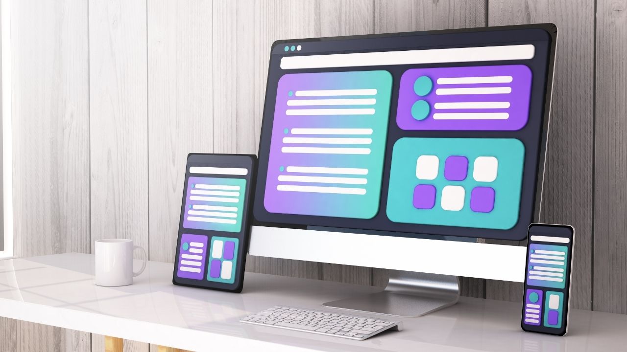
When it comes to responsive web design, grid systems offer several benefits. Firstly, they ensure that the content is displayed properly across different devices and screen sizes. This allows users to have a consistent and optimal viewing experience, regardless of the device they are using.
Secondly, grid systems help in organizing the content and making it visually appealing. With a well-structured grid system, designers can easily align elements, create balance, and maintain a clean and professional look.
However, implementing grid systems in web development can come with its challenges. Common issues include difficulty in making the grid system responsive, managing complex layouts, and accommodating varying content lengths.

Despite these challenges, the benefits of using grid systems outweigh the drawbacks, making them an essential tool for modern web design.
Key Principles for Creating Consistent Web Layouts
When designing web pages, it's important to adhere to key principles in order to create layouts that are consistent and organized.
Designing mobile friendly layouts with grid systems is one such principle that can greatly enhance the user experience on your website.
Grid systems provide a framework for arranging content in a clean and structured manner, making it easier for users to navigate and find information. They ensure that your website looks great on any device, from desktop to mobile.
When choosing the right grid system for your website, consider factors such as the complexity of your layout, the type of content you have, and the overall aesthetic you want to achieve.
Implementing Grid Systems for Improved User Experience
By adhering to key principles and utilizing grid systems, you can enhance the user experience on your website and make it more visually appealing.
However, implementing grid systems may come with its own set of challenges. One of the main challenges is finding the right balance between flexibility and structure. You want your website to be visually appealing and consistent, but you also want it to be adaptable to different screen sizes and devices.

This is where optimizing grid systems for mobile devices becomes crucial. It is important to ensure that your grid system is responsive and can adjust to different screen sizes seamlessly.
Tips and Tricks for Organizing Content With Grid Systems
One of the best ways to organize content on your website is by using a grid system with clear guidelines and flexible options. Grid systems provide a structured layout that allows you to arrange your content in a visually appealing and organized manner.
With grid system customization options, you can easily adjust the size and placement of elements to create a balanced and cohesive design. When designing for a responsive website, it is important to consider how your grid system will adapt to different screen sizes.
Responsive design considerations for grid systems include using breakpoints to reorganize content, ensuring that the grid remains flexible and fluid, and testing the layout on various devices to ensure optimal user experience.
Case Studies: Successful Websites Using Grid Systems
To create a successful website using a grid system, you can learn from case studies that showcase effective content organization and visually appealing designs. By studying these examples, you can understand the impact of grid systems on conversion rates and how to overcome challenges faced when implementing them in web design.
Case studies have shown that utilizing a grid system can significantly improve conversion rates. By structuring your web layout with consistency and order, you create a seamless user experience that encourages visitors to stay on your site and complete desired actions. Grid systems help to guide the user's eye and make it easier for them to navigate through your content.
However, implementing grid systems in web design can come with its own set of challenges. One common difficulty is finding the right balance between structure and creativity. It's important to maintain the overall grid system while still allowing for unique and visually appealing designs. Additionally, ensuring responsiveness across different devices can be a challenge, as grid systems may need to adapt and adjust to different screen sizes.
Frequently Asked Questions
How Do Grid Systems Affect Website Loading Speed and Performance?
Grid systems can impact website loading speed and performance by providing a structured layout that improves visual aesthetics and enhances website navigation. They ensure consistency and order, resulting in a smoother user experience.
Are There Any Limitations or Drawbacks to Using Grid Systems in Web Design?
Using grid systems in web design has limitations and drawbacks. They can make it difficult to create unique layouts and can be restrictive when it comes to responsive design and accommodating different screen sizes.
Can Grid Systems Be Used Effectively for Responsive Web Design?
Yes, grid systems can be effectively used for responsive web design. They provide structure and consistency to layouts, making them easy to adapt across devices. Case studies have shown successful implementation with improved user experience and design efficiency.
How Do Grid Systems Contribute to Accessibility and Usability for Different User Groups?
Grid systems contribute to accessibility and usability for different user groups by impacting visual hierarchy and enhancing user navigation. They provide a consistent and organized structure that helps users easily navigate and understand web content.
Are There Any Best Practices for Maintaining Grid Systems Across Different Devices and Screen Sizes?
To maintain responsiveness and ensure consistent grid systems across different devices and screen sizes, consider scaling considerations. It's important to follow best practices like using flexible units, media queries, and testing on various devices.
Conclusion
In conclusion, grid systems are essential in web design for achieving consistency and order in layouts. By following key principles and implementing grid systems, web designers can greatly enhance the user experience.
Organizing content with grid systems allows for a visually appealing and user-friendly website. Numerous successful websites have utilized grid systems effectively, showcasing their importance in creating a cohesive and well-structured design.

So, remember to embrace grid systems in your web design process for optimal results.